

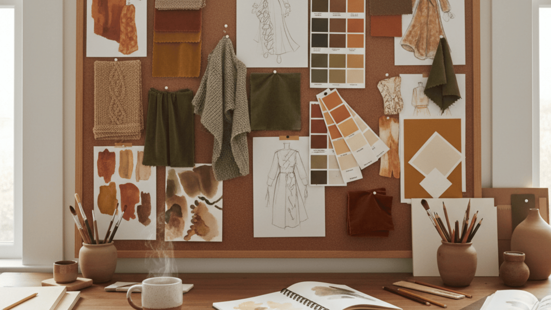
Autumn arrives with a quiet change, turning the world into a canvas of warmth and depth.
The season’s colors, burnt oranges, deep greens, golden yellows, and rich browns, capture a sense of calm style perfect for creative expression.
Whether in fashion, interiors, or design, fall’s palette speaks in textures and tones that balance comfort with refinement.
Each hue tells a story of transition, effortlessly blending softness and strength.
Using the right fall color palette allows creators to mirror nature’s harmony while infusing projects with emotional depth, making every composition feel grounded, inviting, and classically graceful.
What is a Fall Color Palette
A fall color palette is a curated collection of hues that reflect the warmth and richness of the autumn season.
It draws inspiration from turning leaves, golden sunlight, and natural textures to create inviting harmony.
Common tones include warm browns, burnt oranges, muted golds, olive greens, and deep burgundies, all evoking comfort and style.
Hex codes ensure these colors stay consistent across digital and print projects, making them essential for designers, stylists, and creators seeking seamless coordination in fashion, interiors, branding, and other creative expressions of the season.
How to Choose Your Fall Color Scheme
Choosing a fall color scheme starts with understanding undertones and saturation. Muted shades create softness, while vivid ones add energy and depth.
Neutrals like taupe, cream, and brown ground a palette, giving balance to brighter accents.
The right mix depends on your purpose: styling requires wearability, interiors need warmth, and branding benefits from memorability.
Aim for three to five harmonious colors for visual balance. Keep selections simple and intentional, allowing each hue to stand out while maintaining the natural flow of autumn’s character.
Fall Color Palettes With Hex Codes
Fall color palettes bring warmth, texture, and richness to any creative or personal styling project.
Below are thoughtfully curated palettes that capture the season’s essence with ready-to-use color codes.
1. Harvest Sunset

This palette captures the warmth of a golden autumn evening with earthy oranges and deep browns balanced by creamy neutrals. It radiates cozy, inviting energy.
Colors:
-
Burnt Orange: #D35400
-
Rusty Red: #8B2500
-
Golden Amber: #DAA520
-
Warm Brown: #7B3F00
-
Cream Beige: #F5EBDD
Best use: Cozy fashion styling, café branding, seasonal illustrations, warm-toned photography.
2. Woodland Whisper

Inspired by forest trails and moss-covered bark, this palette mixes greens, browns, and muted gold for a serene, organic aesthetic.
Colors:
-
Olive Green: #6B8E23
-
Mossy Taupe: #9C9B86
-
Charcoal Slate: #45484F
-
Soft Mustard: #D2B04C
-
Bark Brown: #4A3626
Best use: Outdoor apparel, rustic interiors, nature branding, sustainable design.
3. Mulled Wine Evening
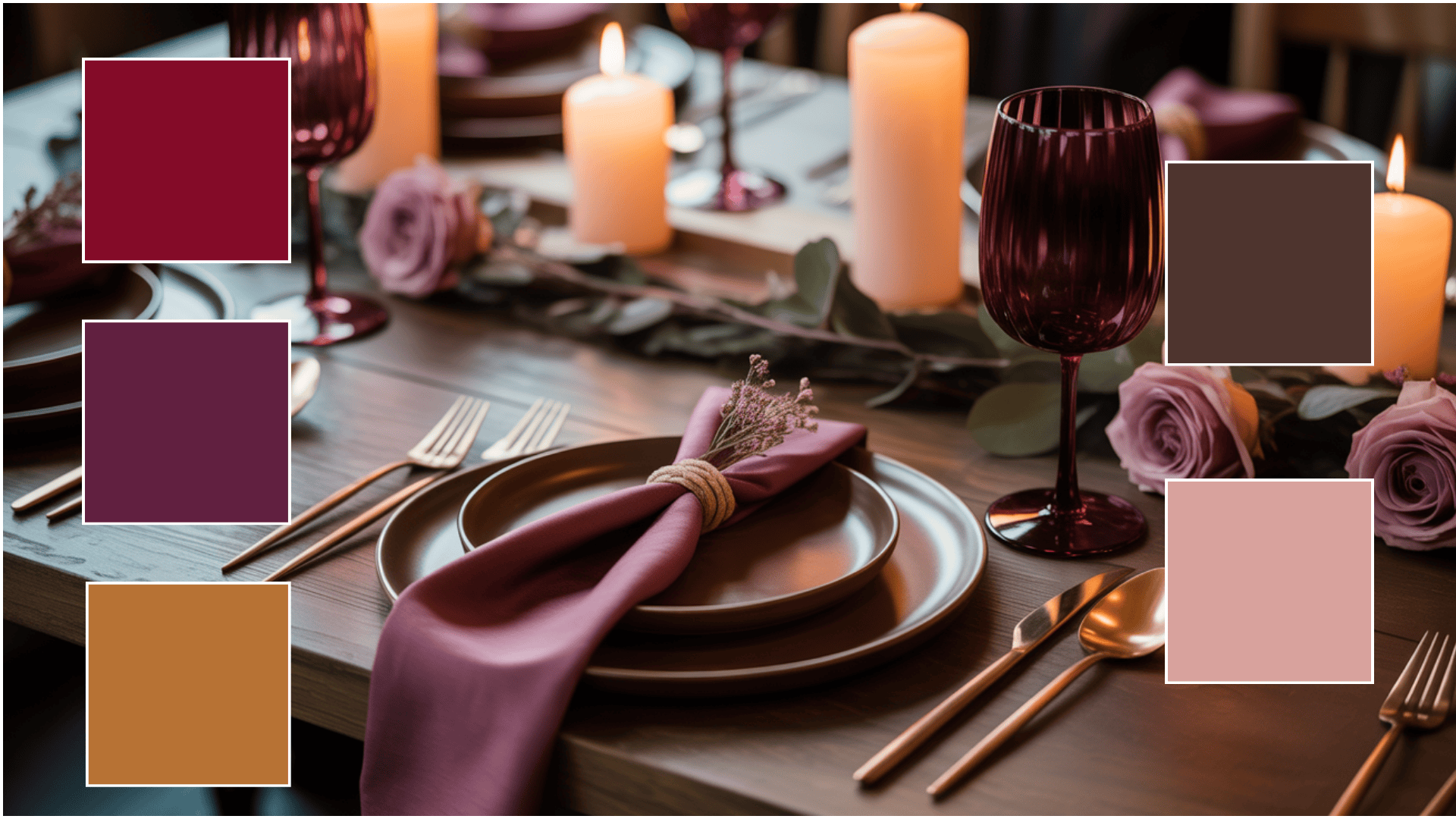
Rich and romantic, this palette blends deep reds and warm metallics with soft undertones for luxurious style.
Colors:
-
Burgundy: #800020
-
Deep Plum: #602040
-
Copper: #B87333
-
Mocha: #4E342E
-
Dusty Rose: #D8A39D
Best use: Evening wear, candle branding, event design, and premium packaging.
4. Pumpkin Spice Latte
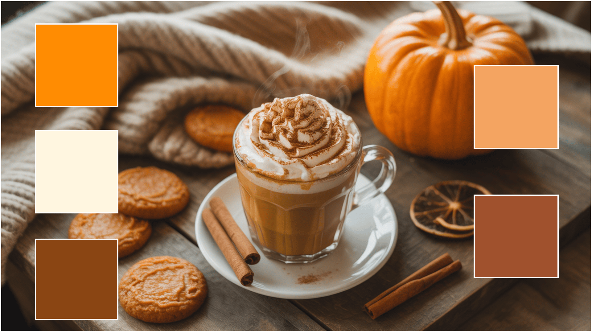
The ultimate fall favorite, this palette pairs warm oranges with creamy neutrals and browns for a comforting seasonal look.
Colors:
-
Pumpkin Orange: #FF8C00
-
Latte Cream: #FFF5E1
-
Cinnamon Brown: #8B4513
-
Sandy Beige: #F4A460
-
Caramel: #A0522D
Best use: Coffee shop branding, lifestyle visuals, fall outfit pairings, product packaging.
5. Golden Harvest
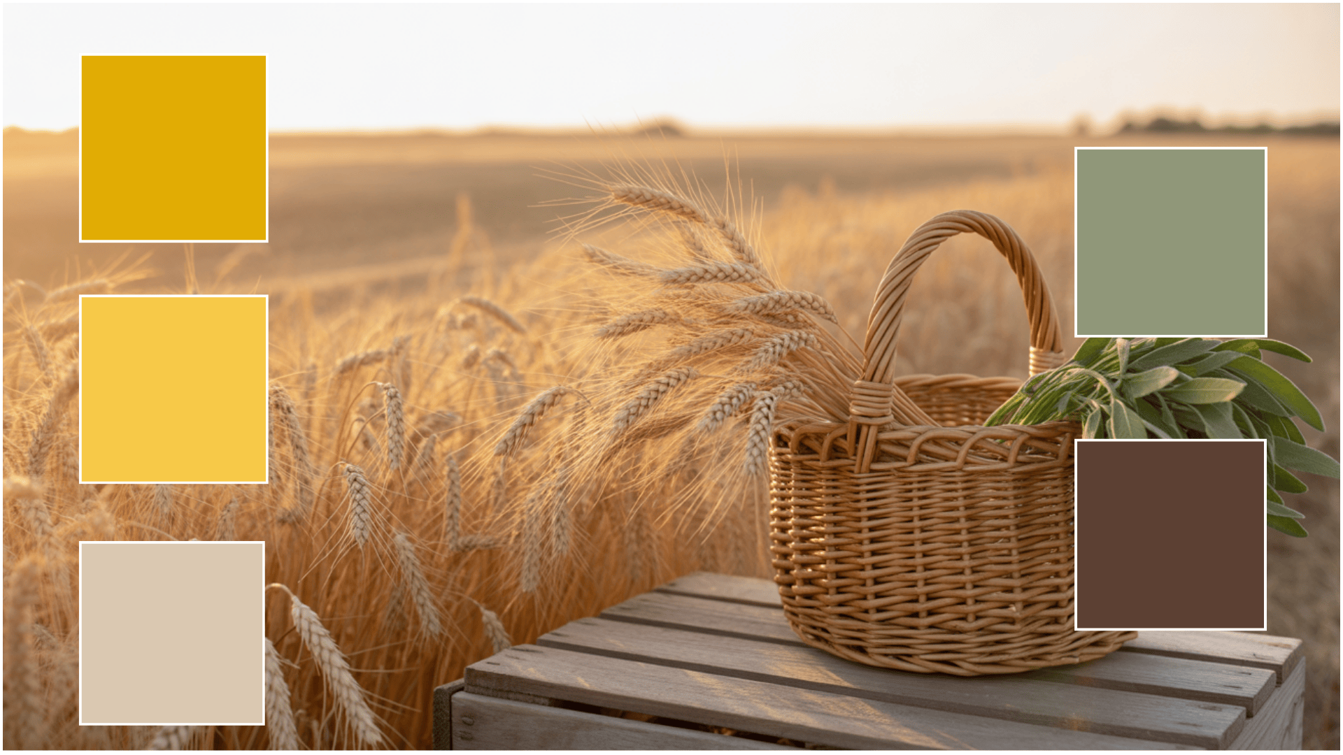
A cheerful, earthy palette that mirrors golden fields and soft autumn light, balanced with muted greens.
Colors:
-
Mustard Yellow: #E1AD01
-
Light Gold: #F7C948
-
Wheat Beige: #D9C9B1
-
Sage Green: #8F9779
-
Walnut Brown: #5C4033
Best use: Home décor, seasonal weddings, editorial layouts, lifestyle photography.
6. Deep Forest Twilight
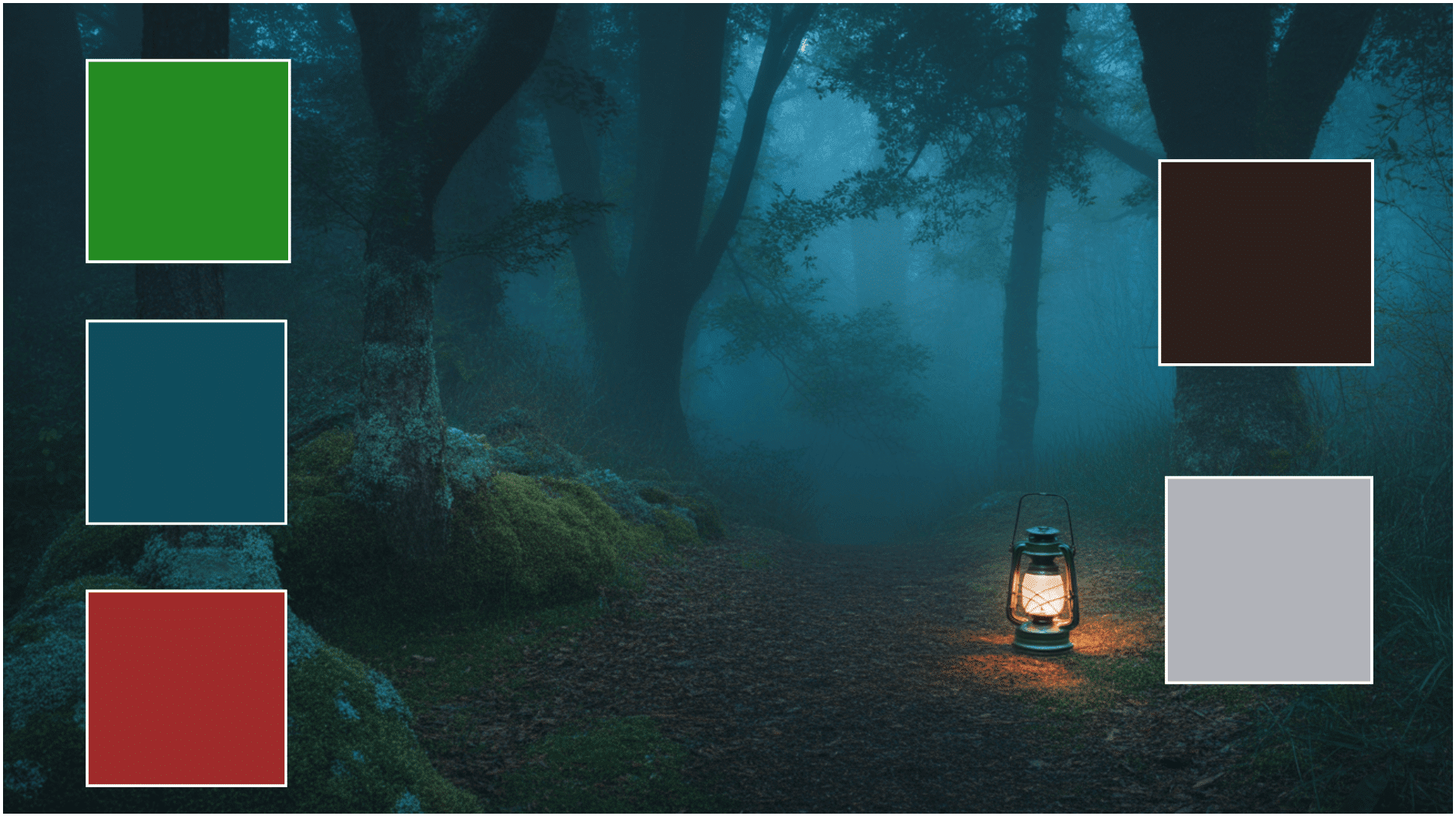
Dark and moody, this palette reflects twilight in the woods with deep greens, teals, and earthy undertones.
Colors:
-
Forest Green: #228B22
-
Emerald Teal: #0F4C5C
-
Dark Amber: #9E2A2B
-
Espresso: #2C1E1B
-
Misty Grey: #B0B3B8
Best use: Luxury branding, dramatic interiors, editorial design, fashion lookbooks.
7. Soft Fall Morning
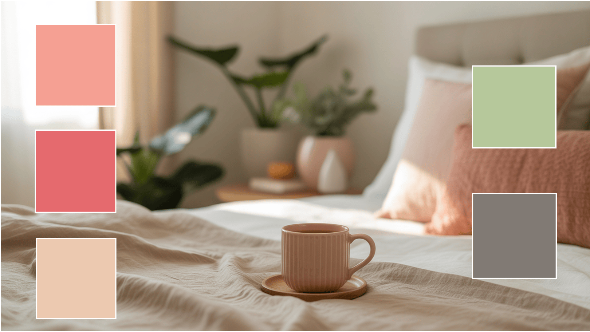
Calm and romantic, this pastel-tinged palette captures the serenity of early autumn light and muted tones.
Colors:
-
Blush Peach: #F6A192
-
Muted Coral: #E56B6F
-
Sandstone: #EDC9AF
-
Pale Olive: #B5C89A
-
Smoky Taupe: #827A75
Best use: Capsule wardrobes, minimalist branding, wedding stationery, soft home décor.
How to Apply Fall Color Palettes
Using fall color palettes effectively can turn any space, outfit, or project.
The key lies in balancing warm tones, earthy neutrals, and textured contrasts to create a cohesive seasonal look that feels both intentional and inspiring.
1. Clothing Inspiration
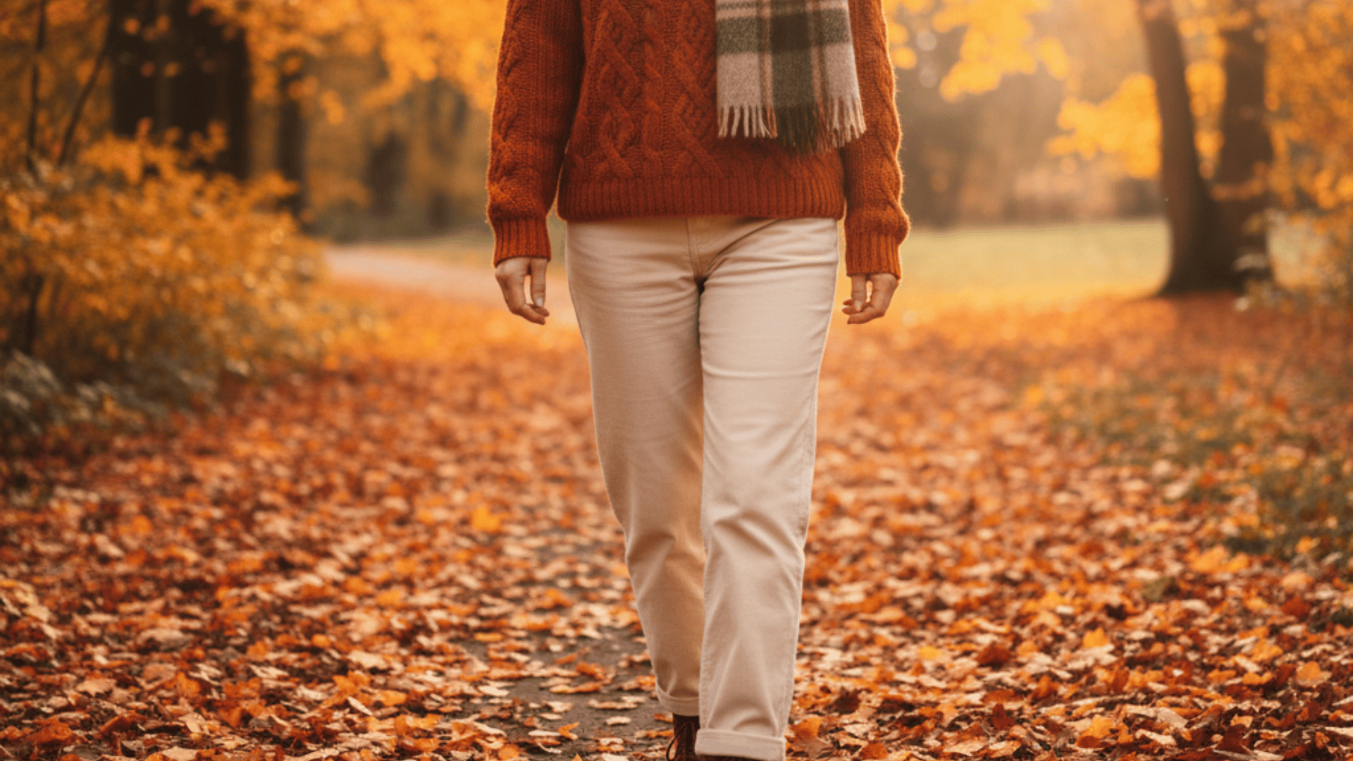
Bring fall’s palettes to life with classic, layered looks that showcase warmth and texture:
- Cozy Casual Layers: Burnt orange or olive-green knit sweater with cream trousers or dark denim, finished with brown boots and a wool beanie.
- Smart Autumn Essentials: Mustard or caramel shirt paired with taupe chinos and a camel trench coat; complete with leather loafers.
- Elevated Evening Look: Deep burgundy dress or charcoal blazer with plum accents, styled with copper or bronze accessories.
- Minimalist Fall Neutrals: Sandstone or blush tones in a wool coat, knit turtleneck, and tailored trousers, paired with suede loafers for refined simplicity.
Styling Tip: Choose three complementary tones, one dominant, one neutral, and one accent, and rely on texture (wool, corduroy, or suede) to express the richness of fall’s natural tones.
2. Interior Design
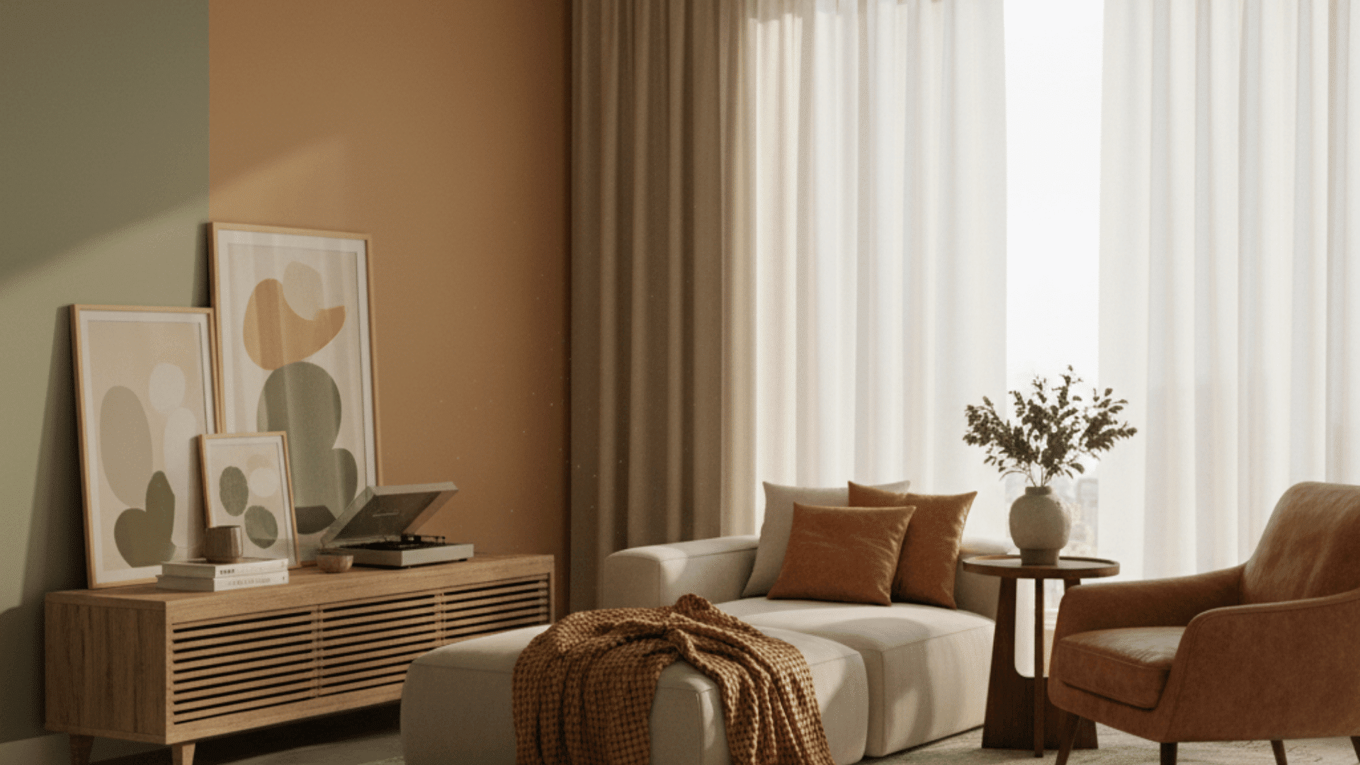
In interiors, apply the 60-30-10 rule to balance color proportion. Use earthy tones like Caramel or Sage Green for walls or upholstery, then highlight accents such as Copper or Mustard.
Layer textures like wool, leather, and linen for a naturally cozy, autumnal atmosphere.
3. Photography and Art
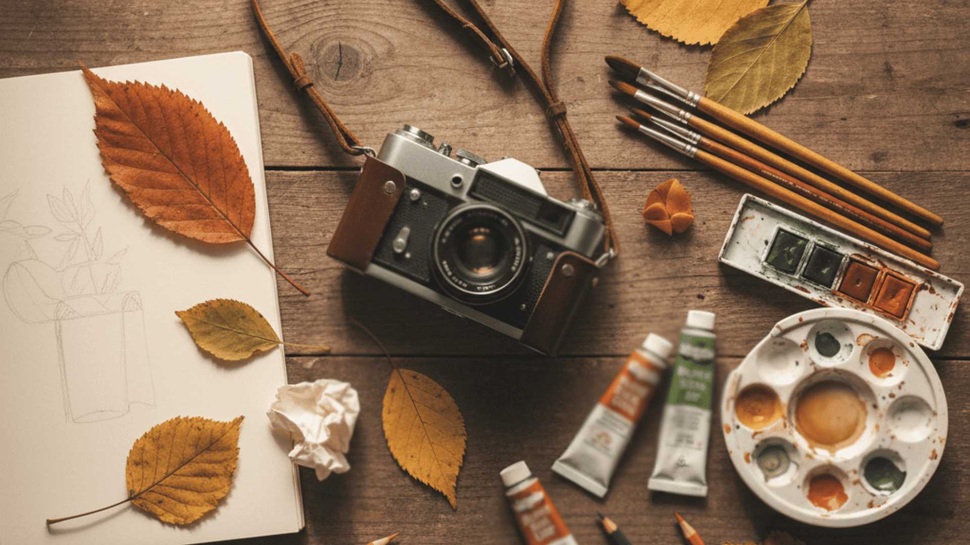
Compose shots or artworks using one strong warm tone balanced by cooler shades. Burnt Orange or Mustard adds vibrancy, while Olive or Taupe grounds the frame.
Subtle desaturation and natural lighting highlight warmth and depth, enhancing the emotional feel of autumn aesthetics.
4. Creative Tips
Introduce fall colors gradually, integrating one or two hues from your chosen palette at first. Keep tones cohesive by avoiding clashing undertones.
Use materials, lighting, and layering to emphasize warmth and texture while maintaining an inviting seasonal flow across designs or outfits.
Pinterest Fall Outfit Inspiration
Pinterest offers endless visual ideas for creating layered, seasonal looks that feel effortlessly stylish. Imagine soft knits paired with tailored coats, ankle boots, and cozy scarves in warm, earthy tones.
Outfits often feature subtle contrasts, like deep reds with creamy neutrals or muted greens with soft golds, capturing the comfort and richness of the season.
From relaxed weekend combinations to elevated everyday wear, these ensembles show how thoughtful color pairing and texture can bring warmth, balance, and sophistication to any autumn wardrobe.
Conclusion
Fall color palettes embody the heart of the season, warmth, comfort, and creativity blended into every shade.
They evoke nostalgia, capture nature’s richness, and inspire creative expression. Experiment with combinations, layer textures, and embrace the beauty of imperfection that autumn naturally offers.
From cozy pumpkin tones to deep forest greens, each palette tells a story of transition and harmony.
Which fall color palette inspires you most? Share your favorite combinations or styling ideas in the comments below!
link